

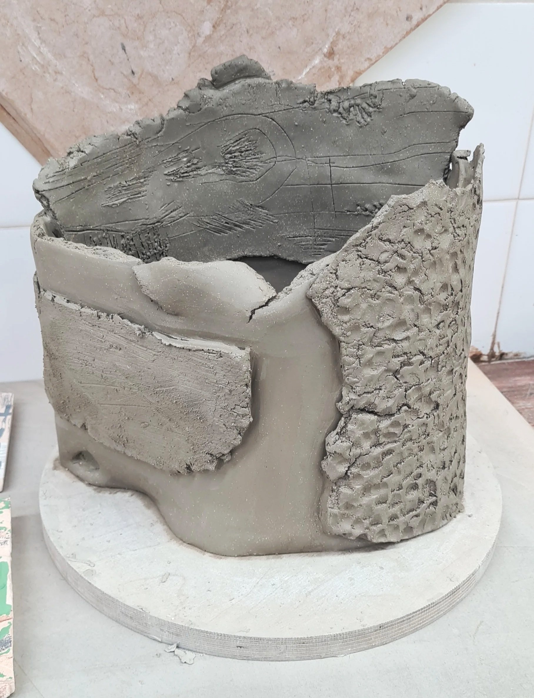
Collaging & being bolder with Slip
After texturing some slabs, I loved the idea of ‘sticking’ them on a form like pieces of collage. I used different textures, thicknesses of clay, cracked the surface of some, drew into some with a knife and imprinted some slabs with textured items. I really liked the final result of this build. The slip additions towards the end really brought the piece to life and highlighted the collaged areas.
The combination of slip and texture, created a visual dynamic between the two. The ‘push & pull’ forces of the two worked cohesively. In addition, drawing into the slip after application created a depth of layering, later to be enhanced through glazes.
The form
I created a vessel form, with torn edging. The piece has an organic shape, allowing the slab to dictate the final movements of the vessel. The texture was applied to the collaged slabs before application.
I enjoyed the 3D effect they had, standing out from the surface, creating depth and shadow. The slabs were also torn at the edges, creating a cohesiveness throughout the piece.
Initially, I was unsure about the free-hand knife drawing I did on the back slab. I thought it appeared weak in comparison to the other elements and thought it could get washed out in the glaze process.

Slip application
Using a brush, I applied black, white and blue slip. Black in the exterior background, white in the interior and blobs on the front and then blue on the slab wrapped around the front of the piece.
The blue slip was the beginning of me exploring colour within my work. I want to create visual contrast yet create a harmonic piece were all the elements work in tandem. I feel like colour can achieve this visual contrast, alongside the textural elements.
I’m excited to see how the depth of black heightens the other additions.
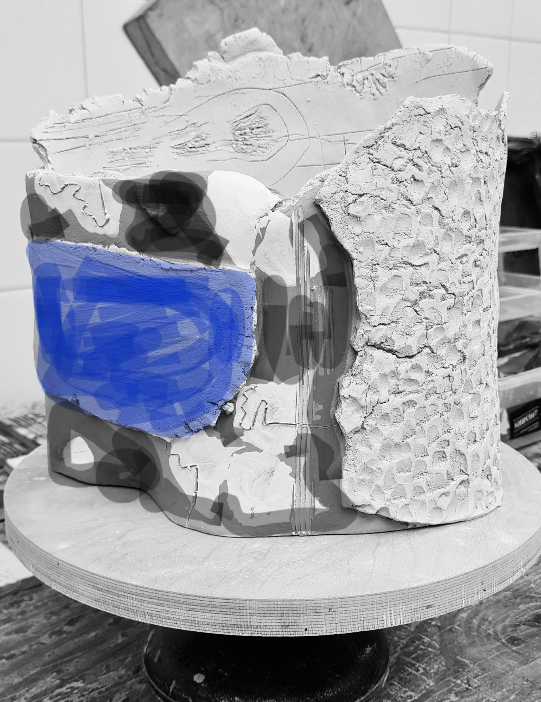
Visualising glaze
This was me visualising how the slip’s would look after firing- I used my phone to colour in the blue and shade out the black. It helped decide on my glaze choice and what areas to leave exposed and what to cover.
In the end- I decided to fire it in reduction and use some of the results from my test tiles on this piece.
In the cracks and fine line drawing, I soaked in copper ox to help amplify the details, washed it back multiple times and re-applied to create a layered depth. Inside the piece, I used brown/red engobe and drew some marks using a stick. This creates a result with little control over the outcome.
I then used Test Tile 9 (Base glaze recipe C from the Potters Palette book with cobalt carb 0.5% and Titanium 5%) This was applied on some of the collaged slabs. I used thin layers to help keep the integrity of texture.
Around the blue slab, I applied transparent glaze, as in reduction, it turns a grey/blue colour. This was just applied on the edges to enhance the shine and 3D appearance.
I applied Test Tile 22 on the inside texture details. This was base glaze C with 1.5% copper ox and 3% vanadium pentoxide.
It’s currently waiting to be put into the reduction firing, so check out my portfolio, semester three page for final images!