

Screen-printing with Micaela Schoop
Micaela was a guest lecturer within the department for a couple of weeks in July. In that time she showed us, through a workshop, how she created her highly complex and detailed patterns on her ceramic pieces. This method was developed during her time on the Ceramic MA course, where she enlisted the help of the print department to help create these re-useable screens for printing onto her ceramics.
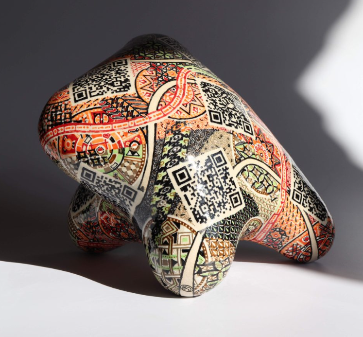
Micaela’s work
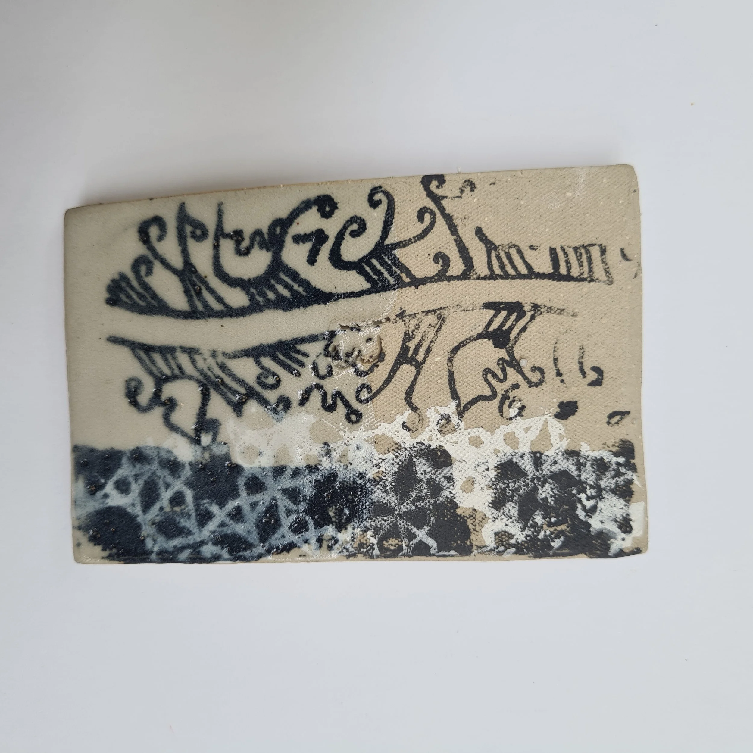
Micaela’s work discusses themes around ethnicity, identity and belonging. The screen-printed patterns on her work all have ties to a cultural context as she uses her ceramic work as a pedestal to showcase these themes.
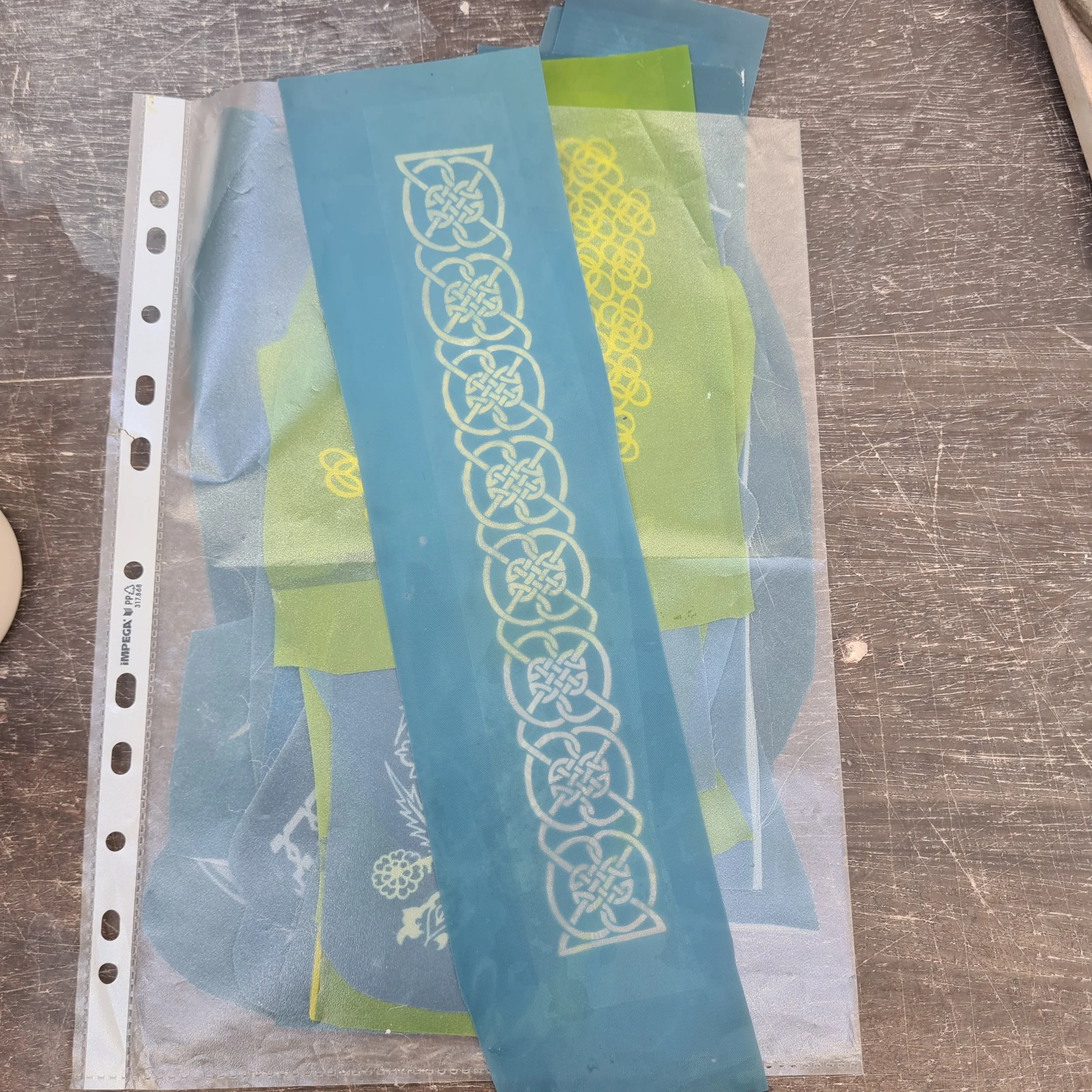
Micaela began drawing her patterns onto acetate with a dark red sharpie or posca pen (I believe) - In comparison to black, it actually did a better job at blocking out the light during the screen making process. She would layer the design on the acetate with multiple layers, so it created a strong barrier to the UV light. Once her patterns were drawn up onto acetate, the print department could then use these to create the printing screens.
They apply emulsion onto the screen and then place Micaela’s patterns over the top. They then lock it in a UV light chamber, which blasts UV rays through the emulsified screen. When complete, they jet wash off the emulsion and the pattern is left printed onto the screen. It look’s like the images above. Instead of using a typical screen printing ink and pressing it through onto paper, the cut out the individual patterns so Micaela could then bend them round her ceramics and press through her own ceramic ink.
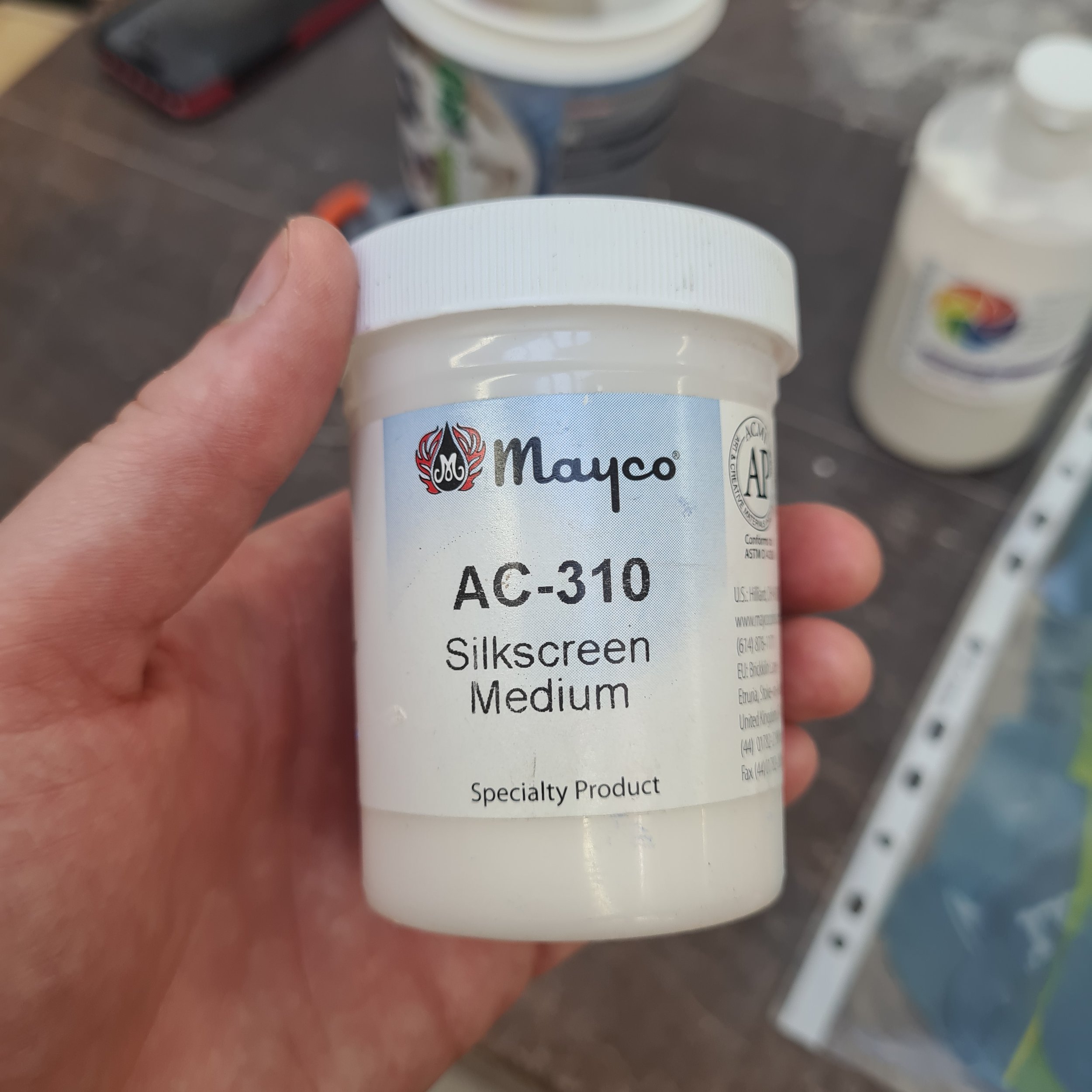
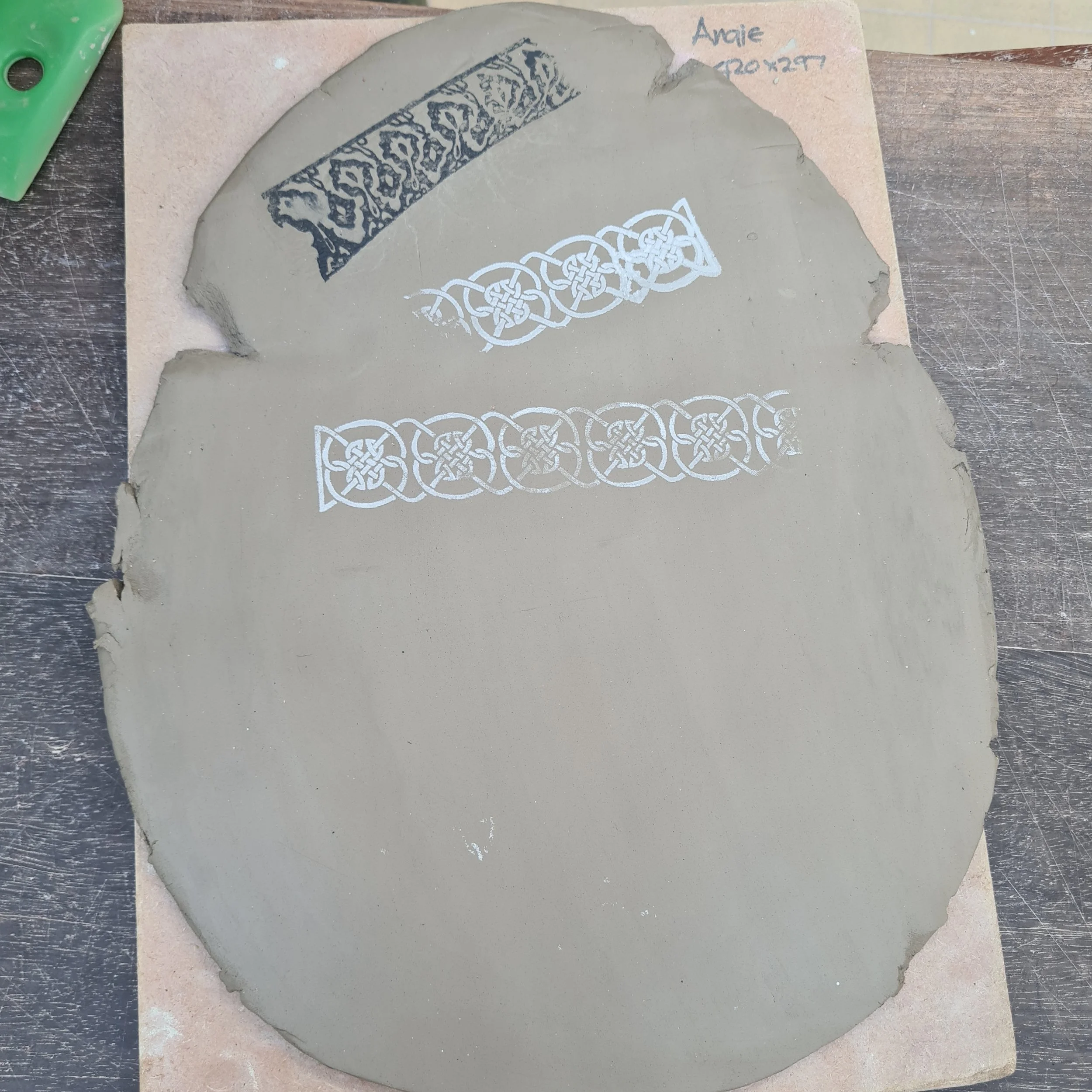
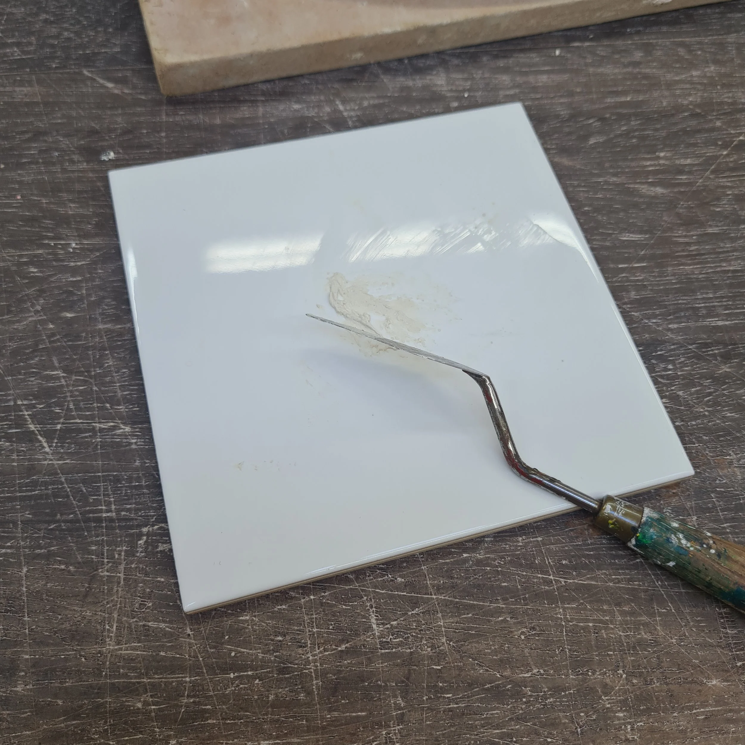
In this case it was a black or white underglaze, mixed with the silkscreen medium. We used a palette knife on a tile to mix it together as it just thickens the underglaze slightly. We then put the screen onto a leather hard piece of clay or bisque ware and pushed through the medium with our fingers. It was very satisfying, as it left a perfectly crispy pattern! You can even blend colours of underglaze, to create an ombre effect.
REFLECTION
This was an incredibly useful process to learn, as I feel outside of the ceramic MA, it would be difficult to gain the knowledge on how to achieve such an outcome or even have access to a wide range of industry equipment. Following on from my Mono-printing blog post, I feel this could be the next stage of developement.
As stated in previous posts, I love the idea of using very selective text or numbers within my work. Having to ability to create ‘perfectly crispy’ text or numbers, in contrast to my highly abstract and sculptural approach’s, could aid that visual dynamic I’m looking for. In 2nd year, after some development around context, I’d like to revisit this process and see if it’s fits in with my practice.